|
Sagelight Pro Saturation Controls Quick Reference
Hover the mouse over the circular tabs for a description of each function
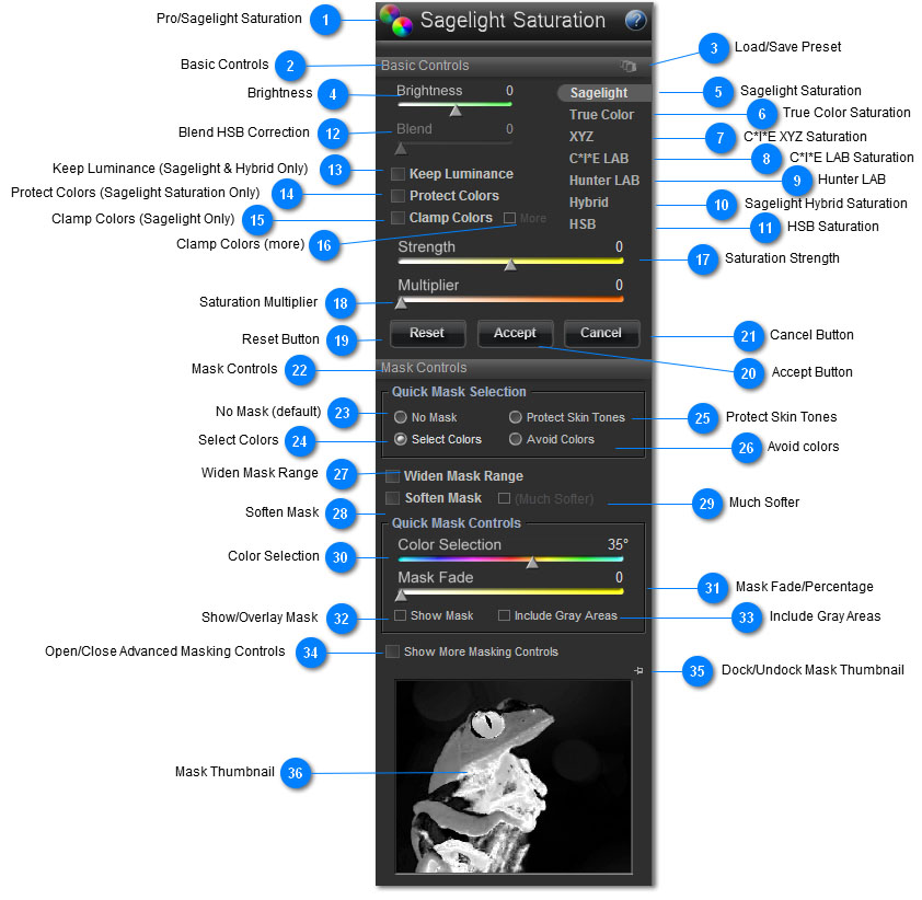
 Pro/Sagelight Saturation
The Pro Saturation/Sagelight saturation feature gives you access to over 8 different saturation methods, all of which have a specific strength.
Adding color to your image can make all the difference in giving your image a crisp, striking look, or bringing out specific subject areas. However, saturation methods can be somewhat fickle, working well with some pictures and not others. Sometimes, the colors will become too bright, overrun, or change to a color that just doesn't have the same quality of the starting color.
Sagelight's Pro Saturation features was built for just these problems in mind, offering 8-10 different saturation methods, as well as Sagelight-developed saturation methods to help avoid and control traditional problems with adding color to your image.
Sagelight Saturation, True Color Saturation, and Hybrid Saturation were developed specifically for Sagelight to work with some of the problems issues involving adding color to your image:
-
Noise. Adding color to your image can often produce noise or speckling in your image, especially when the image was originally saved as a Jpeg (but also when it was saved as a 16-bit-per-channel RAW image). Sagelight saturation methods keep noise at a minimum, often removing it altogether where the same method using traditional would not.
-
Color Fidelity. Most traditional saturation methods (except, for example, HSL saturation (which has many other problems)) start to shift certain colors of your image as you add color. For example, a blue sky can often turn cyan; a green can also turn neon, etc. Sagelight saturation methods stay as true as possible to the original color. note: sometimes the color shift in other methods can be useful. For example, sometimes a sky can go more blue when it wasn't the original color, which can be a nicer effect, even if it is not technically accurate. This is one of the reasons why many different saturation methods are presented.
-
Luminance Fidelity. Many saturation methods will also change the luminance of your image in certain areas, typically over-brightening images in certain areas, causing bright colors (such as red, bright greens, blues, etc) to become blown out. Also, from a technical standpoint, it can be a nice look when colors actually deepen when you saturation your image. Sagelight saturation methods do both (see the individual descriptions).
-
Color Overruns (i.e. reds). Deep colors can often overrun in your image, leaving a very unrealistic look to your image. Sagelight saturation methods manage this as much as possible. The Sagelight Saturation method, for example has the "Clamp" and "Clamp" more, as well as the "Protect Colors" options to help avoid this.
|
 Basic Controls
This area controls the saturation controls, which give you a large amount of control over how the saturation is applied.
|
 Load/Save Preset
Click this button to load are save a preset. This will save all information regarding the current settings, including any mask settings.
|
 Brightness
This slider increases the brightness of your image prior to adding saturation.
The main purpose of the slider is to decrease the brightness level, as decreasing the brightness prior to adding saturation can cause the addition of color to your image to come out much better. Try this slider if your image starts to become too bright or colors overrun in your image. If your image is bright at all, this can be a good option to try just to see how it may cause the addition to color to look better.
In some cases, such as with dark pictures, adding brightness (prior to saturation, as in this case) can make your image look better, too. If your image is dark, try increasing the brightness.
|
 Sagelight Saturation
Strengths: Deep Color, natural, scenic, outdoor images. Anything where you want strong, vibrant colors
Sagelight Saturation was developed specifically for Sagelight and is a very high-level, algorithmically intense saturation.
Sagelight saturation works by keeping the color fidelity and luminance fidelity as tight as possible, allowing for deep saturation with little or no noise compared to other saturation methods.
Sagelight saturation is designed to deepen the colors as you add color to your image, as this typically works better for an image. However, you can control this with the "Keep Luminance" switch, which tells Sagelight Saturation to preserve the luminance of the image.
Sagelight Saturation is also designed to move the colors to their primary colors as you add color to the image. This allows the colors to deepen. For example, a blue sky will typically turn to a darker blue instead of a cyan, as the color is moving to the primary blue. Green plants will move more towards a deeper green than a yellow, and deep orange skies will move towards a deeper orange/red as you add color.
You can also control this factor with the "Protect Colors" switch, which tells Sagelight Saturation to maintain the original HUE, which can prevent deepness, but can also be useful in keeping certain colors from moving to their primaries.
Sagelight Saturation has many options to help with getting the best color for your image. See the sections on Keep Luminance, Protect Colors, Clamp Colors, and the More switch next to Clamp Colors.
|
 True Color Saturation
Strengths: Bright, accurate color. Images where you want to add strong color while keeping the details very crisp and focused.
True Color Saturation is another Sagelight-developed saturation method. True color is based on HSL saturation, but maintains the light and removes the noise and neon-effect that HSL saturation can often created.
HSL saturation is notably the most accurate saturation method in terms of color accuracy, but also creates a large amount of noise and light problems with your image.
Sagelight's True Color Saturation increases the saturation in your image with the HSL component, but also maintains the light and color in your image, which prevents the traditional problems with HSL saturation.
If you wish to use HSL saturation in Sagelight, use the Power Curves with the Chroma channel in HSL mode.
|
 C*I*E XYZ Saturation
Strengths: Deep, warming colors. Useful on images where deep warming works well, such as grassy plains, earth-tone images, pets (i.e. dogs with brown, beige fur), etc. Can often work well on skin tone, but see the C*I*E LAB saturation notes.
C*I*E XYZ Saturation. XYZ saturation can be very useful, especially when it comes to images where you want a warm effect. XYZ saturation tends to move your image a warmer state. This works well with certain nature images, as well as some indoor images. In some cases, this may also work better with certain skin tones.
Where saturation methods like Sagelight's Sagelight Saturation or Hybrid Saturation work to deepen color, XYZ saturation has a different strength in helping to tone your image in a manner that -- while somewhat unrealistic -- can help make your image look nice because of its warming, flood-like properties.
|
 C*I*E LAB Saturation
Strengths: Skin Tones, bringing out blues and light greens/yellows. Can also create a 'cooler' (i.e. less warming) version of an image, which can look more neutral than XYZ and other saturation methods.
C*I*E LAB's biggest strength is skin tones. In many pictures, the central focus is a person. C*I*E LAB Saturation can add color in ways that helps preserve a great skin-tone color and contrast.
C*I*E LAB Saturation can have add a slight warming tone to your image, but can also bring out the blues and greens in your image in a very strong manner.
Like XYZ saturaiton, C*I*E LAB saturation will warm your image, but it will also bring the blues and lighter colors with it.
If you're working with a skin tone, try this saturation method. C*I*E LAB has a peculiar quality of not only keeping the skin-tones realistic, but also helps out the other colors in the image in ways that help the central focus of the image. In one other areas, LAB mode can overrun colors, but when the focus is a person, the reality with the non-skin-tone colors are much less significant.
|
 Hunter LAB
Stengths. Deep Warming, virbrant colors. Also useful as a reference, as Hunter LAB is used in other editors. Useful on certain outdoor images, or anything with an earth-tone (browns, greens, dark reds) as a focus.
Hunter LAB is like XYZ saturation, warming your image and working well on certain earth-tone colors. Hunter LAB will also bring out the colors in your image, brightening them while keeping them deeper.
Try switching between Hunter LAB and XYZ mode for comparison. Typically, Hunter LAB will present an image with deeper color saturation than XYZ mode, which can have advantages.
Hunter LAB is similar to Sagelight Saturation (with "Protect Luminance" checked), except that Hunter LAB warms the image, where Sagelight stays truer to the original color.
Hunter LAB is also similar to Sagelight's Hybrid Saturation (with the "Protect Luminance" checked).
|
 Sagelight Hybrid Saturation
Sagelight's Hybrid Saturation is an intensive saturation that also warms as well as deepens colors.
Recognizing that while it's technically not accurate, the warming effect that some saturation models (i.e. XYZ, Hunter LAB) have can be very useful to your image, Sagelight's Hybrid Saturation was developed to have similar properties of Sagelight Saturation, to protect your image from noise as well as deepen colors while staying truer to the original color 'direction' (more below).
In it's default mode, Hybrid Saturation deepens the colors of your image while warming it. In some pictures, the result is similar to Hunter LAB, and with the "Keep Luminance" button checked, they are even more similar.
However, Sagelight Hybrid Saturation, like Sagelight Saturation, starts drawing the colors of the image to the primary color, allowing it to deepen and stay much more crisp than Hunter LAB or XYZ saturation as color is added. This means that skies become deeper blue, and greens become deeper green, where Hunter LAB and XYZ saturation will move the warming more to a central color. Sagelight Hybrid Saturation allows you to warm your image while simultaneously deepening the colors in your image.
In most cases, this works out well. But, it is always worth clicking between the other saturation methods (such as Hunter LAB or Sagelight Saturation) to see the difference.
|
 HSB Saturation
HSB (Hue, Saturation, Brightness) is a traditional saturation, and is included in the Pro Saturation feature for its vibrance-like qualities. While Sagelight has an extensive vibrance feature (three of them, in fact, in the Power Box and a more Powerful Vibrance function, as well as the Vibrance Curves), the HSB vibrance is included because it is technically a saturation function, and isn't quite suited as a vibrance-only function.
One of the reasons for its inclusion is the "Blend Slider", which allows you to correct the color-deepening and noise generated by typical HSB saturation.
When the Blend Slider is set to 0, the HSB saturation acts as traditional HSB saturation. As you move the slider out, it becomes a color- and luminance-corrected saturation. This an often be an interesting look for your image, though it is traditionally just for effect only.
Many people like to use the HSB for its vibrance-like qualities, though the Sagelight Vibrance function in the Power Box or Vibrance Function is recommended.
|
 Blend HSB Correction
The Blend Slider corrects the HSB saturation color and light values. Traditional HSB saturation deepens color as you add saturation, and also causes noise. Sometimes images can look very nice with the vibrance-like nature of traditional HSB saturation, but can often times look very noisy or too unrealistic.
The Blend Slider corrects the color and light values, slowly removing the vibrance effects and noise with the saturation. By moving the slider anywhere from 0 to 100%, you can get even more interesting effects from the HSB saturation, while keeping some of the elements that make HSB saturation useful.
|
 Keep Luminance (Sagelight & Hybrid Only)
Sagelight and Hybrid Saturation Only.
Sagelight and Hybrid Saturation purposely deepen color as saturation is added to your image. Depening colors while satuation can often make an image lok more realistic as the colors darken. For example, a blue sky will become darker blue instead of staying bright and looking as if it is oversaturated.
In some cases, however, you want to maintain the light, as the colors may become too deep or just not look the way you want them to.
When the Keep Luminance checkbox is checked, the light is maintained and the colors will not deepen.
This can be very useful, for example, with skin tones (also use the Protect Colors checkbox for skin tones)
|
 Protect Colors (Sagelight Saturation Only)
Sagelight Saturation Only.
Sagelight Saturation deepens colors and moves them to their primary color to keep a crisp, deep tone. For example, greenish yellows will tend to move to a deep green, and cyans will tend to move to a blue.
In some cases, this may not look good, such as with skin tones, or other brownish tones, but also in general. Skin Tones, for example, will tend to go to the red, which can look unrealistic.
When Checked. When Checked, the Protect Colors selection will keep the colors to the exact hue they were before the color was added. The result will be a saturation that is more technically correct, but will stop the colors from deepening as much. Also try the Keep Luminance checkbox with this option, especially with Skin Tones.
|
 Clamp Colors (Sagelight Only)
Sagelight Saturation Only.
Clamp Colors prevents colors from overrunning. In many images, bright colors (such as reds) will overrun and become too bright and flat in your image.
When the Clamp Colors checkbox is active, Sagelight Saturation will attempt to prevent the colors from overruning.
If you have an image that you wish to saturation that contains high levels of reds, yellows or bright greens, try this switch of they overrun. Also try using the Brightness Slider to decrease the brightness, allowing the saturation (all saturation modes) to work better
|
 Clamp Colors (more)
Sagelight Saturation only.
As with the Clamp Color switch, the "more" switch continues to reduce the color overruns caused by saturation, except much more aggressively.
When checked, this saturation is similar to Sagelight True Color saturation, except that it still depeens colors, which can look more realistic when saturating with high values.
|
 Saturation Strength
This slider controls how much color is being added or removed from your image. Use this slider to the right (increasing values) to add color, and to the left 9decreasing values) to remove color from your image.
When you decrease color, different saturation methods can have different effects, just as when adding color. For example, try removing color with the HSB saturation.
Also see the Saturation Multiplier slider, which works directly with this slider.
|
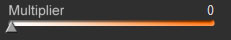
 Saturation Multiplier
This slider directly multiplies the current saturation of the image.
important note: When the Strength Slider is set to 0, this means your image has a saturation value of 1.0 from the perspective of the Multiplier Slider. Therefore, a the Mutliplier starts multiplying the saturation of your image even when the Strength Slider is 0.
another important note: The above means that every saturation value in your image is linearly multiplied by a certain value, which can add a high level of saturation to your image. By contrast, the Strength Slider uses a curve.
The Multiplier Slider takes the current saturation value of each pixel in your image, as converted by the Strength Slider, and then multiplies it starting with 1, with the maximum slider value being around 5.0x.
The Multiplier Slider allows you to get deep saturation from images with little color. Also, you can bring the Saturation Slider back, below 0, and use the Multiplier slider to give a crisp, clean look to your image.
For example, try setting the Saturation Slider from -10 to -25, and then using the multiply slider. This allows you to add high levels of saturation to your image without causing the entire image to become highly saturation (and completely unrealistic).
|
 Reset Button
This resets all values to 0, including any mask settings. The image will appear to have no changes.
|
 Accept Button
Pressing the Accept button will apply the changes to your image and then return to the Quick Edit or Pro Quick Edit Mode.
|
 Cancel Button
The Cancel button will cancel all changes and return to the Quick Edit Mode or Pro Quick Edit Mode without changing your image.
|
 Mask Controls
This set of controls changes the masking of your image.
important note: When adding color to your image, it can often look too overbearing or unrealistic to add color to your entire image, especially with high amounts of color. Also, some elements can use more color than others. For example, sometimes you just want to brighten the sky.
This is where the masking comes into the Pro Saturation feature.
With the masking, you can select a color area, and either add saturation to only that area, or choose to add saturation to all other areas while avoiding the masked area.
You can also choose how much you want to change only the masked area in relation to the rest of the image.
See the control descriptions for more information.
|
 No Mask (default)
By default, no masking is performed and the saturation controls will affect the entire image.
|
 Select Colors
When this is checked, the masking will select the colors you have chosen. You may use the Color Selection Slider or click directly on the screen to select a color.
When you click on the screen, you can leave the mouse button down as you move the mouse. This will show the changes in the Mask Thumbnail and also make the functional (i.e. change how the saturation affects your image) in realtime.
When this checkbox is active, this means that all controls you use will only change the values selected.
The Mask Thumbnail will show these changes, and you can also overlay the mask onto the image with the Show Mask checkbox.
Values are changed based on how much strength they contain in the mask. When a value is pure white, the value is changed at 100% of the controls. When the value becomes darker (i.e. less white and more gray, tending towards black), the controls have less effects. This allows the result to blend into your image naturally.
See the Show More Masking Controls Button for more advanced features.
|
 Protect Skin Tones
See the section on Select Colors (in this general section) for general details on masking.
When this value is checked, skin tones are avoided as you add or remove color to your image. You can also use the Select Colors option to click on the screen (i.e. on the skin tone area) to select a more specific region.
When this button is checked, all saturation and other operations will work with all other areas of your image except for skin tones. Try the Soften Mask and Widen Mask Range with this option to help with the skin tone avoidance.
|
 Avoid colors
See the section on Select Colors (in this general section) for general details on masking.
When the Avoid Colors button is active, the colors selected with either the mouse or the Color Section slider are avoided rather than selected. This works just as the Select Colors mode, but in the exact opposite direction.
In this case, all masked values are avoided, and the non-masked and partially masked areas are affected by the controls, where the masked areas are avoided.
Visually, this means the white areas in the mask display are avoided, and as the masked areas turn gray and tend towards black, more of these areas will be affected by the controls.
Avoid Colors is useful when you want to add or remove color to everything while protecting a certain area. For example, you might wish to add color to the foreground while leaving the sky alone. In this case, you can select the sky and then use the controls to add color to everything else.
This works differently than just being the opposite of the Select Colors mode, since when you select a color, only that color will be affected by the controls. This mode allows you to add colors to everything but the specific color selected.
|
 Widen Mask Range
When you mask a color with the default masking, the range is automatically selected for you. In some cases, you may want to have a wider range. For example, if you've selected the sky, you might want the range to extend into the clouds and other areas.
When checked, the Widen Mask Range mode will increase the range of the mask.
In the Avoid Colors mode, this means that the range of saturation colors will shrink.
|
 Soften Mask
In some cases, the selected mask may appear to be edgy or have blocks created due to a high-level (or poor) JPEG compression.
When check, the Soften Mask option will feather the mask so it blends in with the image much better.
note: watch for halos. High levels or saturation, or distinct color edges, may cause the saturation to look as if there is a halo around it. When this happens, try using the Show More Masking Controls to use more advanced masking.
|
 Much Softer
When checked, this will increase the softening/feathering on the mask. This can help blend into the image better.
note: using this can prevent halos by blending the feathering in much better with your image. However, as with the Soften Mask mode, this can also create halos under certain circumstances. Use the Show More Masking Controls to use more advanced masking when this happens.
|
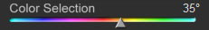
 Color Selection
Use this slider to select the color that is masked.
When you use this slider, and there is a current mask and settings that change your image, you will see two things:
-
The mask image will change in realtime to show you the new mask which is centered on the new color (shown by the slider handle)
-
The image itself will change, since the mask has now changed and adjustments were made based on the controls.
These both occur in realtime and can be very useful in refining your selection.
note: you can also use the mouse. You can click on the screen and hold the mouse button down to refine your selection in realtime. As you move the mouse around with the button down, you will see the same things as noted above. In addition, you will also see the Color Selection Slider handle moving round to reflect the color selected with the mouse.
|
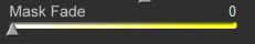
 Mask Fade/Percentage
This slider determines how much of an effect the mask will have on your image.
In Select Colors Mode. In this mode, this will start to add the excluded areas. For example, if you've selected the sky, and the Mask Fade is set to 0 (default), only the sky (and other areas of a similar color) will change. As you move the Mask Fade Slider out, the other areas will start to change as well. This can be very useful when you want to select a principle color, but also want to add some color to the rest of the image.
In Avoid Colors or Protect Skin Tone Modes. If you have a skin-tone selected, for example, when the Mask Fade is set to 0 (default), all other areas in the image will change in accordance with the set controls. As you move the Mask Fade Slider out, the other areas will be included in your image. This is useful when you want to exclude an area, but also want to add color.
notes:
-
Sometimes, when you add or remove color to just one selected area, your image can start to look artificial because of the drastic difference. The Mask Fade Slider allows you to blend the effect in much better by allowing the excluded areas to be slightly affected by the controls, and the focused areas to be changed with the full effect of the controls
-
When the Mask Fade is set to 0, it is if there is basically no mask at all, or as if everything is completely excluded, depending on whether you are in the Select Colors mode, or the Avoid Colors/Protect Skin Tone modes, respectively.
|
 Show/Overlay Mask
When checked, this will show the mask on top if the image itself (rather than just the Mask Thumbnail). This can be useful when you want to get a better idea of the mask, especially when you are zoomed into the image. When zoomed into your image at 100% or more, this will allow you to see edges on your image.
note: With saturation, some edges work fine. It's dependent from image to image. If you see edges in the masking, but they are not harsh, or the added color is slight, it may not make a difference in the result. Masking edges tend to look much more severe when overlaid on top of an image.
|
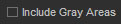
 Include Gray Areas
This is a powerful tool in the making. Note that the main selection for masking is a color. This is typically what you want when you add saturation, as selecting a gray area would typically have no effect.
However, there are areas that are near gray, and there is also the effect the Brightness and possibly other controls have on your entire image.
When Include Gray Areas is checked, this tells the Sagelight Pro Saturation masking to include the gray and nearly-gray areas in the masking.
In the Select Colors Mode, this means these grayish areas will also be selected and changed with the controls. In the Avoid Colors and Avoid Skin Tones modes, this means that the gray areas and nearly-gray areas will be excluded from the controls.
Brightness Slider. The biggest impact is with the Brightness Slider, as including or excluding gray areas can determine how well the control changes blend into your image.
Grayish Areas. With nearly-gray areas, this can also affect how natural your image will look. For example, if you have a sky selected, selecting the Include Gray Areas checkbox will include the regions of the clouds, ground, buildings, car windows, etc. that are very slightly being affected by the sky (i.e. a very light blue color, but barely discernible), and will add color to them as well. The difference can be a less strict division between blue sky and non-blue sky, which can add realism to your picture. In this example, this would cause the grayish areas of the clouds, side of white buildings, etc. to also become a little more blue, which often will look more realistic.
|
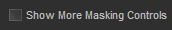
 Open/Close Advanced Masking Controls
Clicking on this button will open the advanced masking, which gives you much more control over the masking. The default masking is a set of simple masking controls designed to be quick and easy.
The advanced masking has many more controls and features, allowing you to create a much more defined mask. These features are also very quick and easy to use, but have more controls.
See the section on Advanced Masking.
|
 Dock/Undock Mask Thumbnail
The mask thumbnail may be undocked, and is useful when either the window falls beneath your available screen sized, or you want a larger thumbnail.
When undocked, the mask thumbnail may be resized by dragging the lower-right-hand corner. You can make the size much larger to see the masking in more detail. You can also use the Show Mask checkbox to see the mask overlaid on the screen.
|
 Mask Thumbnail
The mask thumbnail shows the mask selection.
The non-black areas show the values selected by percentage. If an area is white, the value is selected at 100%, where the percentage is less as the value turns gray and heads towards black.
The affect of the controls is directly proportional to the percent of the mask.
notes:
-
Undock. You can undock this window. Sometimes the window can fall below your desktop size. Undocking it will place the Thumbnail Window on your desktop.
-
Resize. When undocked, you can resize this window to inspect the masking in greater detail.
-
Screen Overlay. You can overlay the mask in the image by pressing the Show Mask button
-
Color Selection vs. Avoiding colors. Keep track of which mode you are using. Select Color mode selects the mask highlighted, while Avoid Colors and Protect Skin Tones modes avoid the colors you have selected.
|
|
|